3 Ways of Using Storytelling in Design
The classic narrative arc
As a child, I loved creating stories. From the time I could hold a pencil, I would write little books and illustrate them.
But when it came time to find a “real job”, I decided to work as a graphic designer because it seemed more practical. I ended up in a role doing routine work and production design.
It was a happy accident that I ended up transitioning to user experience (UX) design. I loved that UX design focused on people: understanding their needs and figuring out what to create for them to meet those needs. I loved the impact that I could make by designing better software products.
What I didn’t expect was that so much of my work would involve returning to what I loved as a child: using images and words to tell stories.
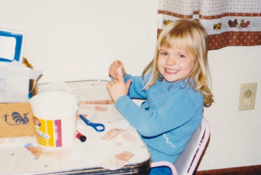
Me when I was 5-year-old, making stories
I use stories in my role as a designer in three ways:
Understanding and advocating for users
Creating lovable, user-friendly products
Presenting a design vision
In this post I’ll share examples with you of each of these. I hope it helps inspire you to tell more stories at work and possibly reuse some of your favorite childhood skills!
Using stories to understand and advocate for our users
One of the ways that we understand our users is through talking with them. We interview users and visit them in their own spaces while doing contextual inquiry. One of the best ways I’ve found to discover people’s needs? Ask them to tell you a story! This is useful because it allows the participant to share what actually has happened in the past, instead of imagining what might happen in the future. It also lets you follow up with questions about their emotions, goals, and beliefs behind their actions.
Certain experiences will stand out more vividly in people’s minds—these are good experiences for them to tell stories about. I’ll never forget this helpful (and rhyming) phrase that Jeff Patton shared in a workshop I took a few years ago:
“People remember the last time, the first time, the best time, and the worst time.”
–Jeff Patton, author of User Story Mapping
For example, you can ask about:
The first time someone logged into your product
The last time they had to contact customer support
The best (or worst!) experience they’ve had with online shopping
After people have told us their stories, we then can use storytelling to engage our teams back in the office and advocate for our users. Remember reading about the story arc in high school? Stories that have a conflict, emotions, and a resolution will get your audience’s attention and help them remember the main idea later.
Why is this? Susan Weinschenk explains in a fascinating post about the brain’s reaction to stories that
“…you are literally using more of your brain when you are listening to a story. And because you are having a richer brain event, you enjoy the experience more, you understand the information more deeply, and retain it longer.”
–Susan Weinschenk, “Your Brain On Stories”
You could even say that stories are the reason that personas are memorable and useful. Personas help us to empathize with our users because they are characters who have goals, emotions, and potential conflicts (their needs and frustrations). We create a resolution every time we come up with a product feature that addresses our persona’s needs.
I agree with Kim Goodwin when she says that personas and scenarios (which we’ll talk about next) must be used together—if not, we’re missing out on the whole picture.
A tweet from @kimgoodwin
We all know the famous Joseph Campbell quote: “people forget facts, but they remember stories.” When I present the results of user interviews or usability testing, I always try to tell mini stories about the users’ experiences. Instead of just reporting “5 out of 6 users failed to complete a task successfully,” I share quotes describing how people felt while they tried and failed (frustrated, confused, annoyed). When I can, I share videos of users expressing their feelings, which is incredibly impactful for those who couldn’t attend the study.
Screenshot from a recording of a usability test
While managing a team of designers doing research with users, I emailed out a newsletter containing stories and memorable quotes from the past month’s user engagements. It was a simple, low-tech effort that helped our entire product organization to better understand the people we built our products for.
TL;DR:
Ask your users to tell you stories. Listen for feelings, not just facts!
When presenting research results to your teammates, tell stories with your users as the main character to help your team empathize and understand
Using stories to create lovable, user-friendly products
“Because interaction design is first and foremost the design of behavior that occurs over time, a narrative structure… is perfectly suited for motivating, envisioning, representing, and validating interaction concepts.”
–Alan Cooper, About Face 3
Remember how I mentioned that as a child I loved to draw pictures and write stories to go with them? I was so excited when I learned about storyboards because I got to draw pictures at work! Storyboards are a great tool for communicating what we expect to happen with our product as a user interacts with it over time.
When creating a storyboard, we first write out a scenario. A scenario has a character with a problem that they try and solve (rising conflict, crisis). Finally, they discover a product or service (the climax) that helps with their problem (resolution).
A simple scenario can be written in just 3 parts: a beginning, a middle, and an ending.
A simple scenario from Nielsen Norman Group
A scenario can be used on its own, but adding images and turning it into a storyboard helps us to visualize the context of how someone will use the product or service. I’ve approached storyboards in different ways — traditionally I’ve drawn out the actual characters in situations. I’ve also included greyscale low-fidelity wireframes as visuals to accompany the scenario for a team of executives who needed to know how a complex tool was going to work. Be flexible with your storyboards: the type of visuals you use depends on your audience and what will resonate with them.
Storyboards are a great tool for concept testing with potential users. They allow you to quickly give participants an understanding of how they might use a product or solution without focusing on the details of the user interface.
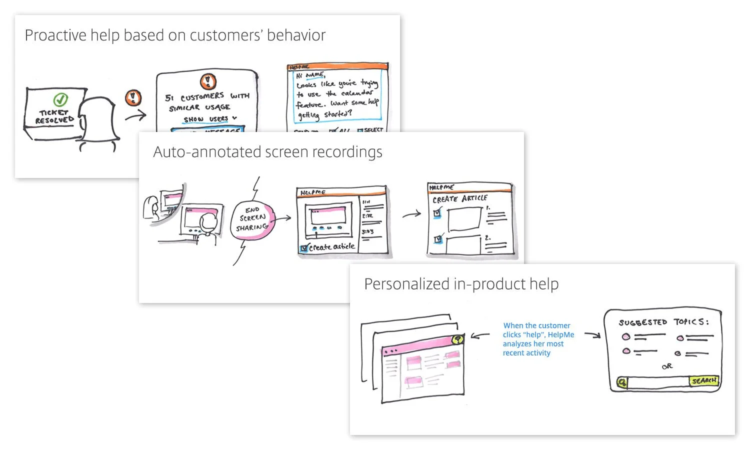
While coming up with new ideas for a tech support tool, for example, I showed multiple storyboards to users and asked what they thought of each idea. This technique is sometimes called “speed dating”: it allows you to test out many different ideas before committing to one.
Storyboards I created for a concept test (I narrated the story)
Journey mapping is another way that we tell our user’s stories by literally representing their “journey” with our product — how they learn about it, their first impressions of it, what they do while using it, how they get help, etc. Visualizing the users’ emotions during their journey can give us a crucial view into areas where the product needs to be improved.
The most successful storyboards and user journey maps I’ve seen have a beginning, conflict, and a resolution. They also show emotions, whether through simple smile/frown faces, color, or quotes. The emotions help us empathize with our users and see how our product empowers (or frustrates) them.
For another viewpoint on scenarios and journey maps, I’d recommend this article by Jared Spool which also discusses the difference between scenarios and user stories.
TL;DR:
Try using storyboards to test new concepts with users!
Use storyboards and journey maps that contain an emotional narrative arc to communicate existing user’s behaviors as well, as new product ideas, to your teammates and stakeholders.
Using stories to present a design vision
I love this image from Julie Zhuo’s wonderful article on Design’s North Star.
Illustration by Julie Zhuo from her Medium post Design’s North Star
She explains what a north star is:
“A design “North Star” is a visual output (commonly a video, although it can also be a storyboard, a series of hi-fidelity designs, etc.) that explains the high-level narrative of why an idea or concept will improve people’s lives.”
–Julie Zhuo, “Design’s North Star”
I worked with a team that was trying to completely redesign a product, both architecturally and visually. It was going to be a very long process and the team needed inspiration as well as an idea of what we were trying to build. So, we created a vision video as a north star. Our video told the story of how a person could use our future product. The UI was not completely realistic — it was missing many details that a real product would need—but the point wasn’t to show exactly what it would look like. Our north star gave the team an idea of what an ideal experience for our users would look.
When I told a university class of design students this story, they asked me, “So, you’re saying a north star is something you’ll never make?”
The answer is, well, yes. We make a north star at the very beginning of a project. We know it’s missing details and that things will change as we do product discovery with users. And that’s ok! Having a north star to aim for helps the team focus and move in the same direction (even if our destination changes as we learn more).
TL;DR:
Use a “north star” at the beginning of a project to inspire and excite stakeholders and give your team a vision to aim for.
These are just a few of the ways I’ve used storytelling in design. On a personal note, I’m so glad that my job allows me to do some of the activities I loved as a child, and I like to think that my 7-year-old self would be proud of me. Once you start telling stories, you’ll find countless ways they can help you understand, persuade, and engage your users and teams.
Want to learn more about using stories in your work? I teach classes on storytelling in design—contact me to learn more about an online or in-person training for your team.
If you need someone to test storyboards, create journey maps, or tell your users’ stories, I can help! Learn more about how we help with user research and design discovery.
Originally published in March 2020, updated in October 2022


